Where Quality Food Meets Sustainability and Zero Waste

Our journey with Pep'eat commenced by crafting a brand identity that embodies its core values. The client's vision was to portray a contemporary, casual, and lively image that could seamlessly adapt across different media platforms. We initiated the process by conceptualizing the logo, which revolves around a distinctive element: the frying pan. This iconic symbol is accompanied by abstract references to food products, forming a visually engaging logo that leaves a lasting impression. To complement the logo, we chose a simple, rounded, and bold sans-serif typography that commands attention and reinforces the brand's personality.
With the logo as our foundation, we developed a comprehensive system to effectively communicate the company's purpose.
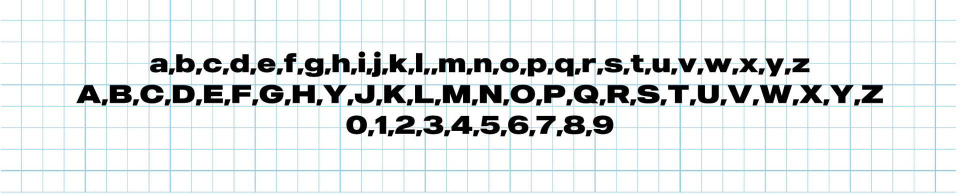
Firstly, we made a deliberate typography selection, opting for a bold weight to highlight the message of "zéro déchet" (zero waste), which serves as a fundamental pillar of Pep'eat's mission.
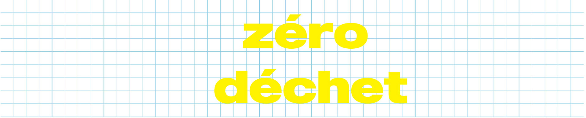
The use of a powerful and substantial weight in the typography not only draws attention but also reinforces the importance and urgency of the zero waste message. It communicates the brand's commitment to promoting sustainable practices and encourages customers to embrace a more eco-friendly lifestyle.
By employing this impactful typography choice, we aimed to create visual impact and effectively convey Pep'eat's dedication to reducing waste and fostering environmental consciousness.
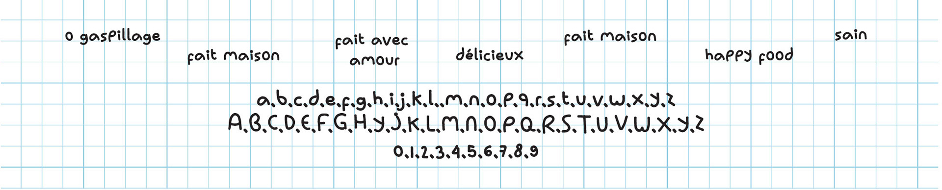
Secondly, we incorporated a handcrafted typography style to deliver small messages across various mediums, adding a personal touch and fostering a strong connection with the audience.
By utilising a handcrafted typography style, we aimed to evoke a sense of authenticity and craftsmanship in Pep'eat's brand communication. This unique typographic approach not only captures attention but also creates a more intimate and relatable experience for the audience.
This typography allows for a more personalised and human touch, reflecting the brand's commitment to creating meaningful connections with its customers. It adds an element of warmth and approachability, enhancing the overall brand experience.
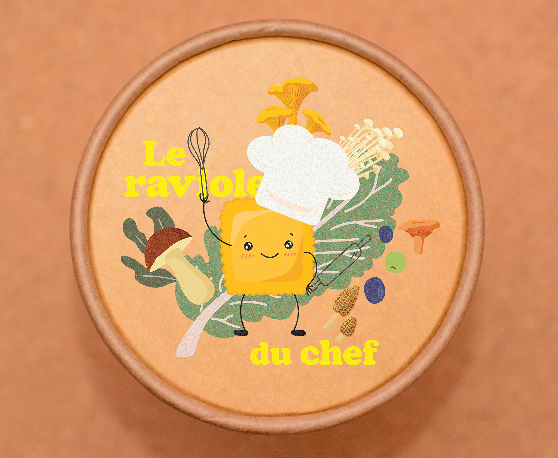
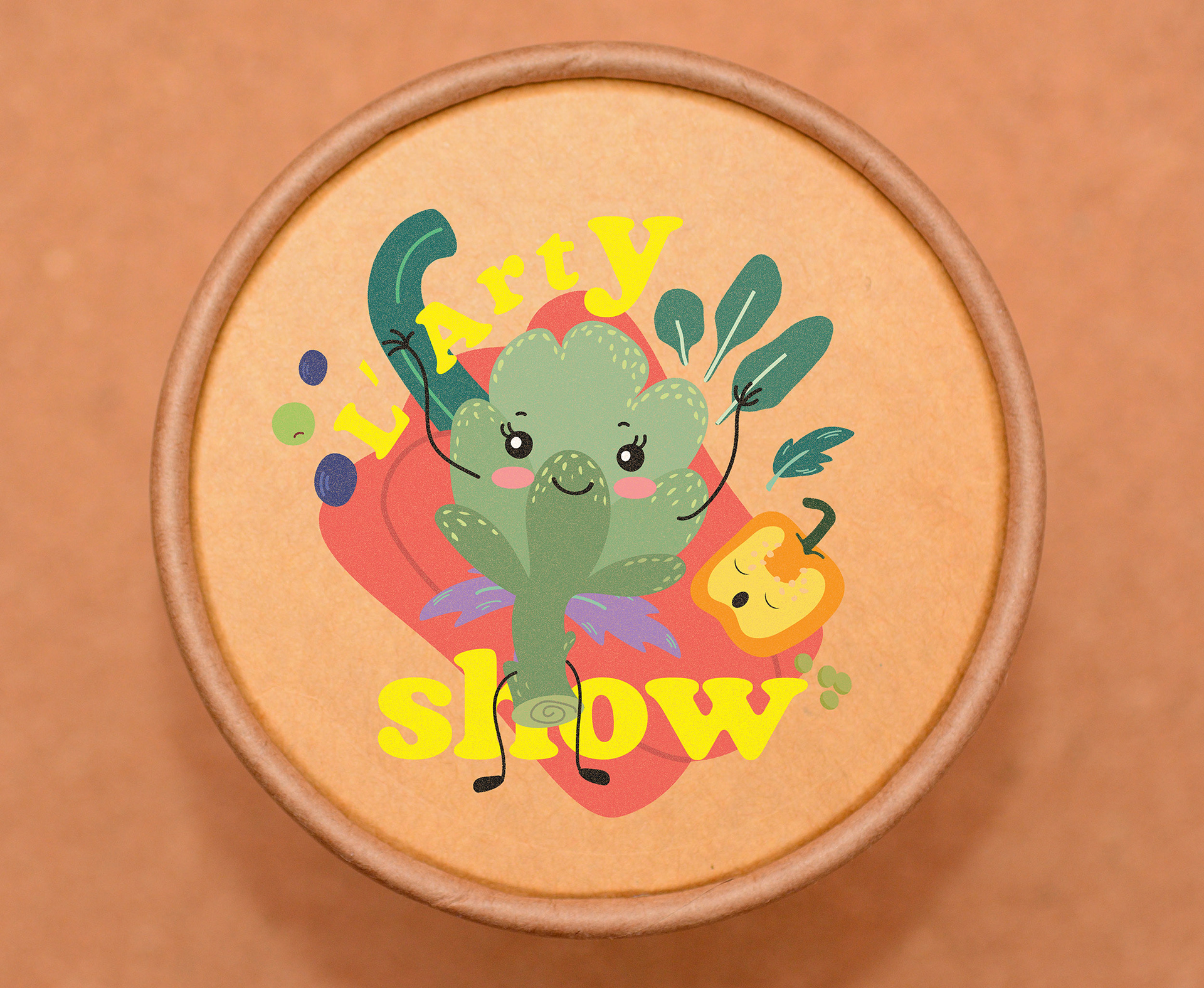
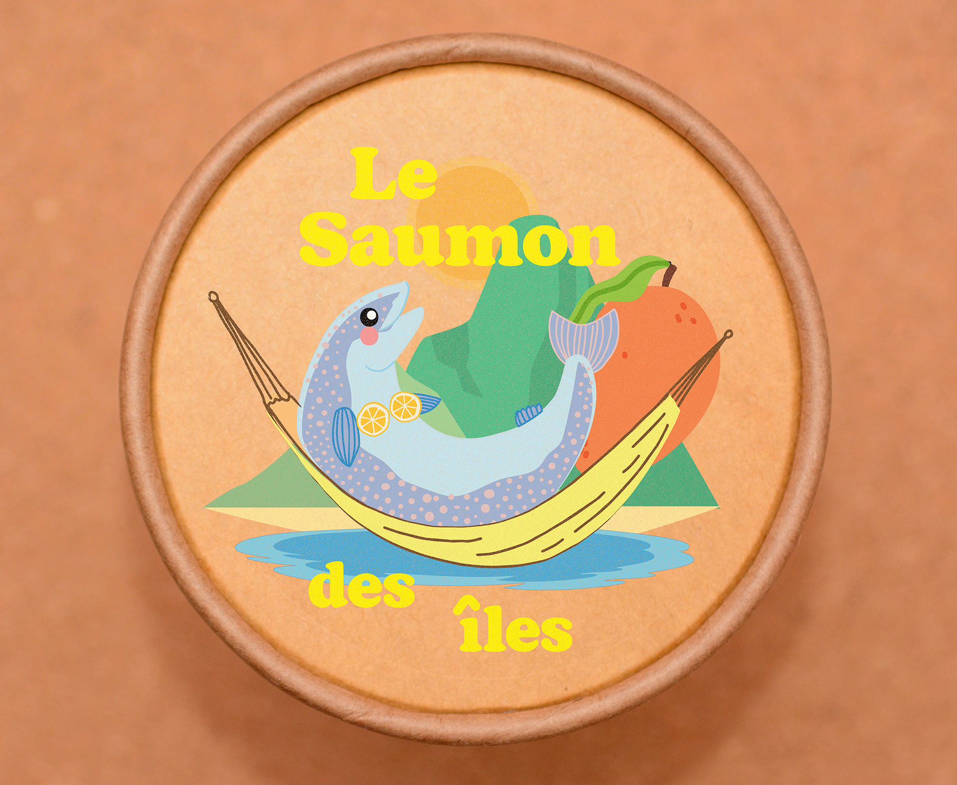
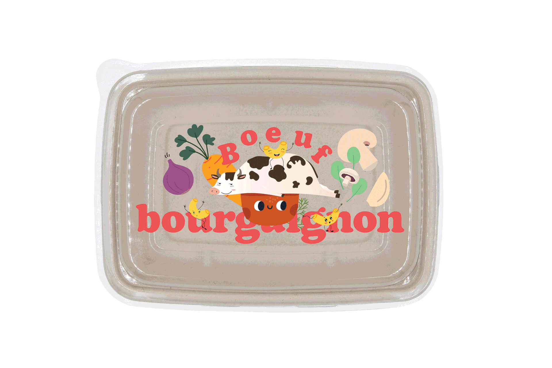
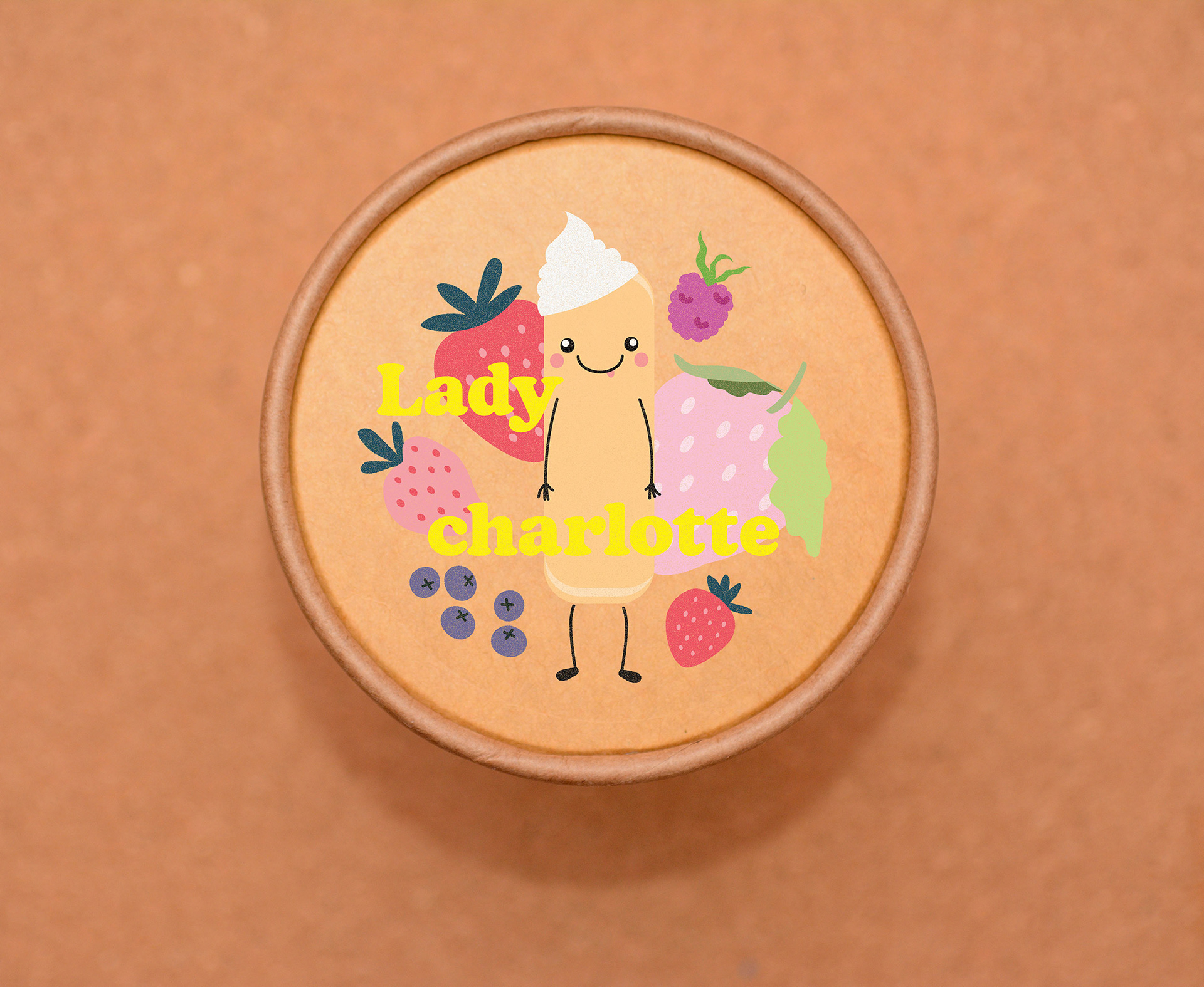
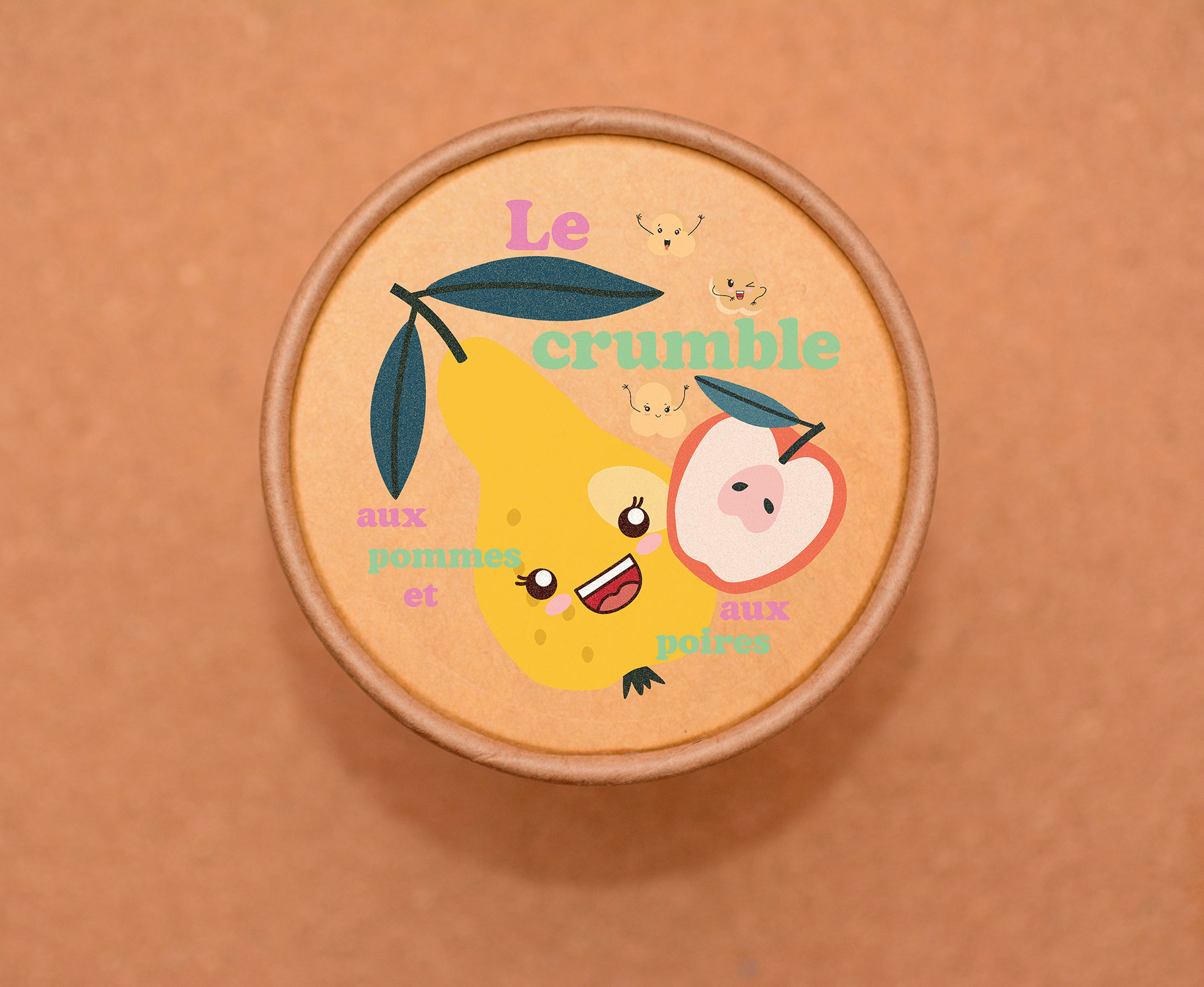
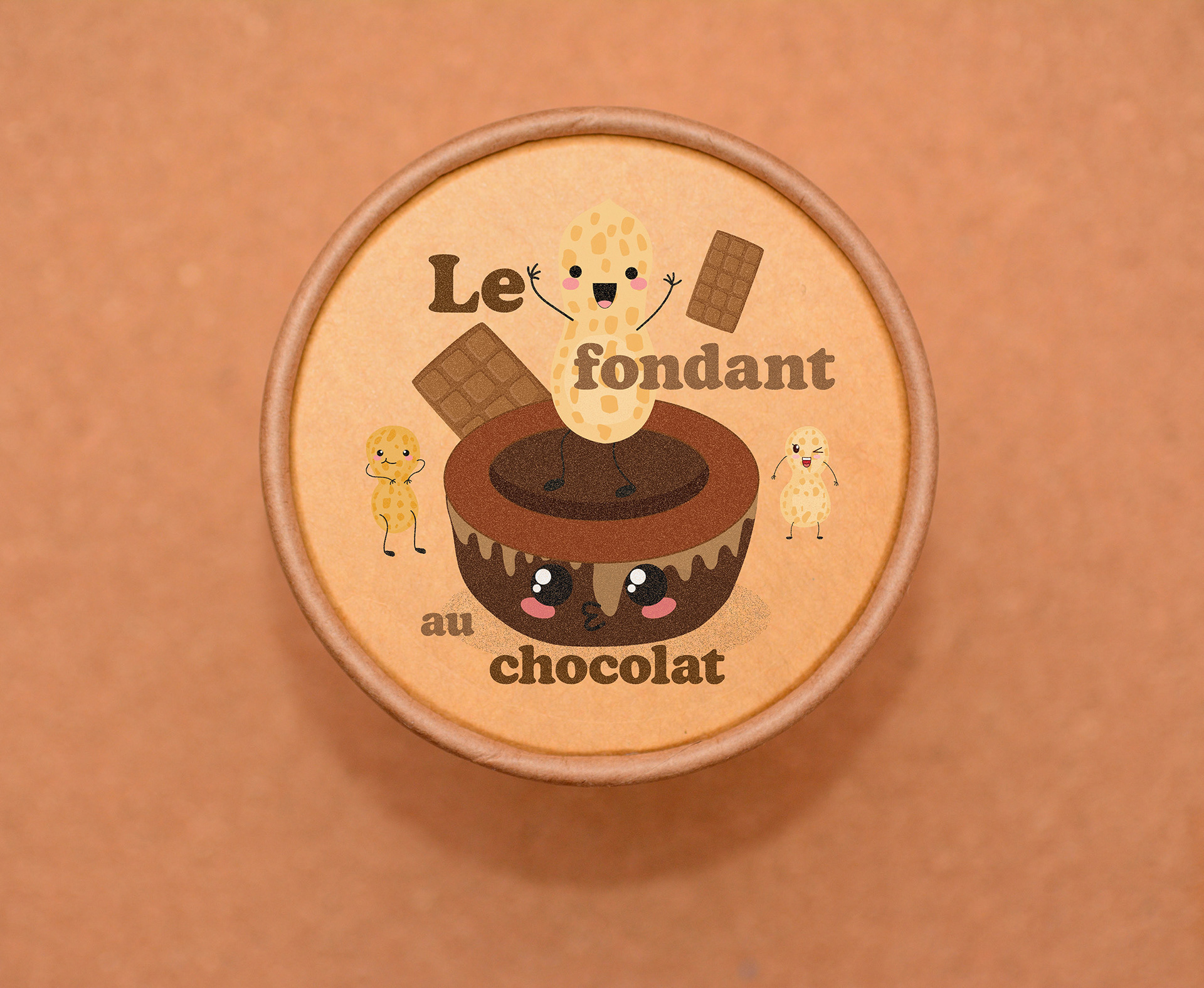
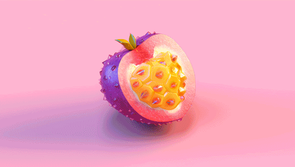
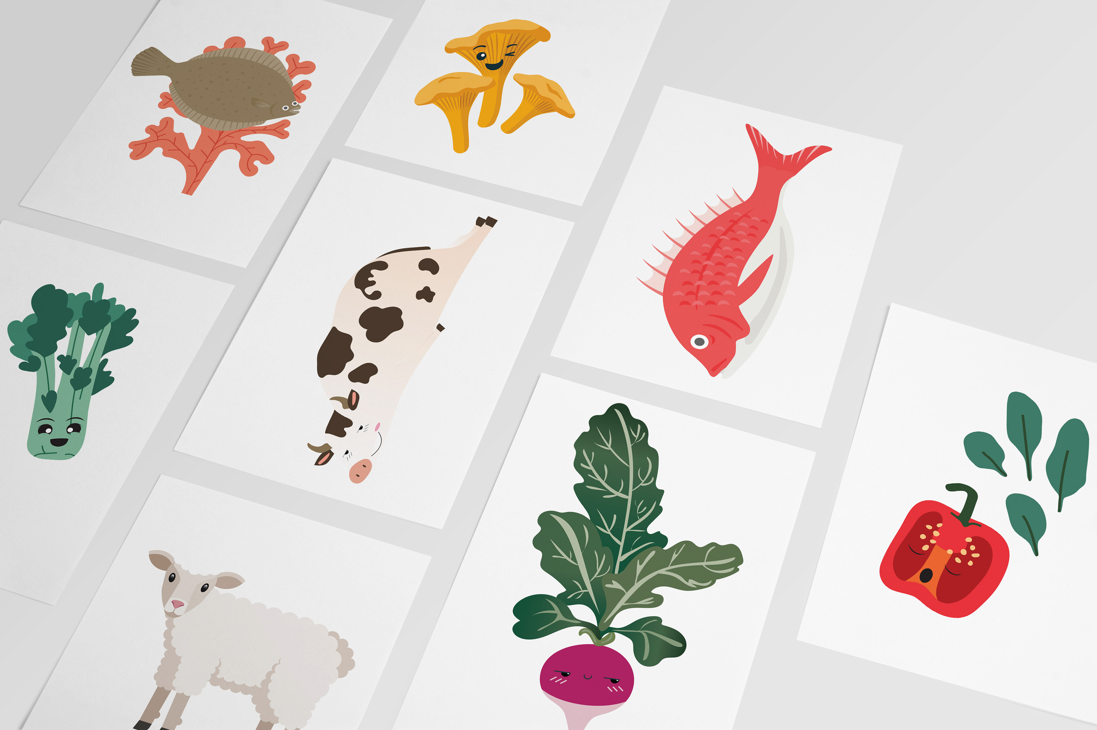
Lastly, we curated a series of illustrations that encapsulate the essence of the brand, serving as a visual representation of Pep'eat's values and mission
Moving on to packaging, we made the deliberate decision to retain a traditional structure for the lunch boxes, as it offers adaptability for large-scale distribution. This choice enabled us to explore various creative elements in the composition while ensuring practicality and functionality.
In line with the brand's dedication to sustainability, we chose to utilize recycled kraft material for the packaging. This not only aligned with the brand's eco-conscious values but also created an intriguing contrast in printing and design.
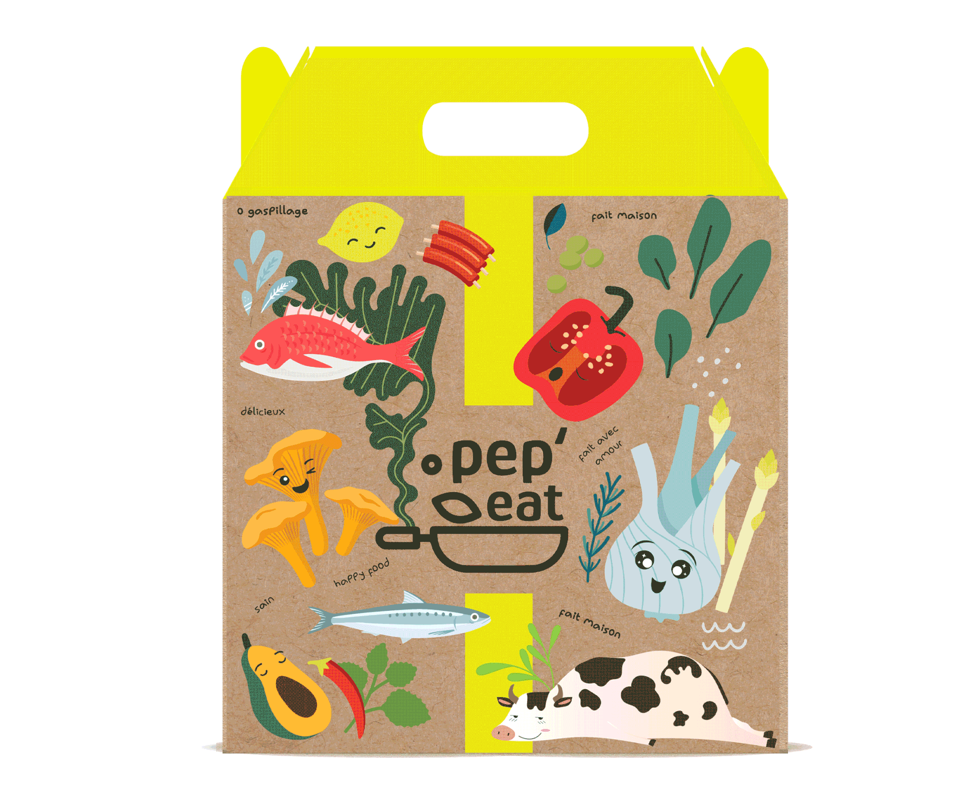
By incorporating recycled kraft material, we aimed to communicate the brand's commitment to environmental responsibility, while simultaneously enhancing the overall visual appeal of the packaging. The rustic and organic texture of the kraft material added a touch of warmth and authenticity to the lunch boxes, enhancing the overall dining experience for customers.
Through this careful consideration of packaging materials and design, we strived to create a cohesive and compelling brand experience that resonates with both the brand's values and the customers' expectations.
Inside the lunch boxes, three recycled kraft packages are included, each accompanied by its respective label that maintains a cohesive aesthetic.