Redefining the Brand Image Through Thoughtful Design

Our role was to revitalize the restaurant's visual identity, harmonizing it with the vision of the new owner while preserving the essence of its name. The client expressed a clear intention to distance themselves from the previous image and embark on a transformative brand journey that would inject fresh energy into the establishment.
With this goal in mind, we embarked on a comprehensive brand lift, reimagining the restaurant's visual elements to create a cohesive and impactful identity. We carefully considered the client's aspirations and the target audience, ensuring that the new image would resonate with both.
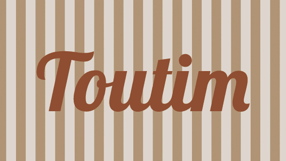
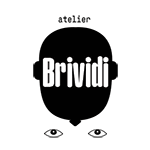
To accomplish this, we embarked on reimagining the logo, seeking a delicate balance between sobriety and elegance while infusing a contemporary touch that aligned with the restaurant's updated vision.
For the typography, we opted for a serif font that exudes a timeless sophistication. However, we added a modern twist by incorporating elements from both traditional and Neue styles. This amalgamation allowed us to create a fresh and captivating aesthetic that resonates with the target audience.
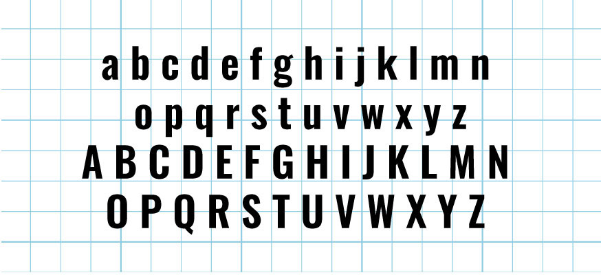
The choice of a serif font signifies a sense of refinement and class, while the modern elements injected a touch of vibrancy and relevance. The resulting typography strikes the perfect balance, embodying the restaurant's desired blend of sophistication and contemporary appeal.

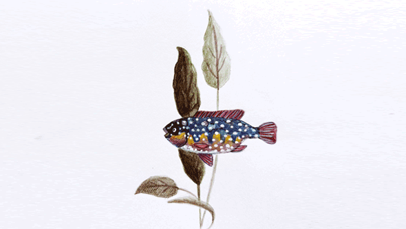
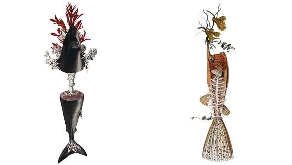
The logo itself was designed to consist of two distinct parts: the typographic element and the isographic element. By incorporating an illustration that breaks away from the previous pattern, we sought to create a visually striking and memorable image. The goal was to strike a balance between playfulness and substance, ensuring that the brand remained engaging without veering into banality. This approach provided the client with the flexibility to adapt the image to different situations, allowing for versatility and adaptability as the brand solidifies its presence.

In addition to the main logo, we also developed variants for different supports, recognising the importance of consistency across various mediums. These variants were carefully crafted to maintain the integrity of the brand while adapting to specific contexts. Whether it be digital platforms, print materials, or physical signage, each variant served as a cohesive extension of the brand, ensuring a seamless and recognisable visual experience for customers.
We believe in the power of design to elevate the dining experience. Through thoughtful brand transformation, we have created an image that reflects the vision and ideals of the new owner while preserving the essence of the restaurant's name. With a renewed identity, we invite guests to indulge in a culinary journey that combines elegance, contemporary flair, and a touch of whimsy.